melaniewinters.com is a participant in the Amazon Services LLC Associates Program, and affiliate advertising program designed to provide a means for sites to earn advertising fees by advertising and linking to amazon.com.
Get the Look:
It's 2016 and if you look at home design trends you'll learn one thing - anything goes. Bold colors, Gatsby inspired wallpaper, florals, geometric patterns, custom bedding and faux fur are all fair game. Chances are; however, that you aren't revamping your bedroom every year to keep up with the latest trends. Sure it's nice to change bedding out occasionally, and introduce new pops of colors through pillows and other artwork, but having an overall design that represents yourself and will stand the test of time is paramount when putting together your master suite.
When designing our home, my husband and I wanted to find a balance between classic warmth and modern bold decor. With family being top priority, we knew we wanted something that would be welcoming and convey a "livable" feel. Sometimes clean-cut and contemporary design makes for a museum-like feel where you are afraid to touch anything or, heaven forbid, leave something out of place. With that being said though, my husband loves crisp lines, simple design and a place for everything so we set forth to find a healthy dose of modern design, luxurious accents, and classic comfort. The good news? Mixing eras is so in right now.
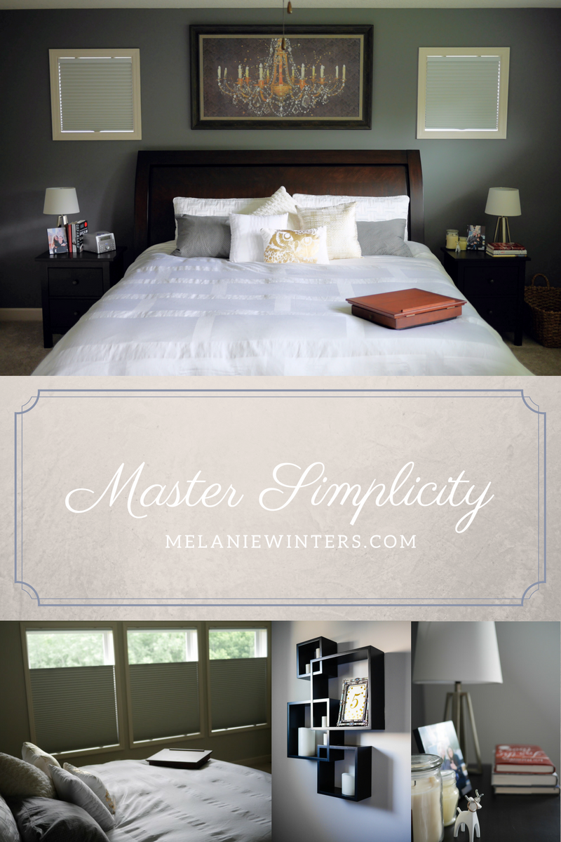
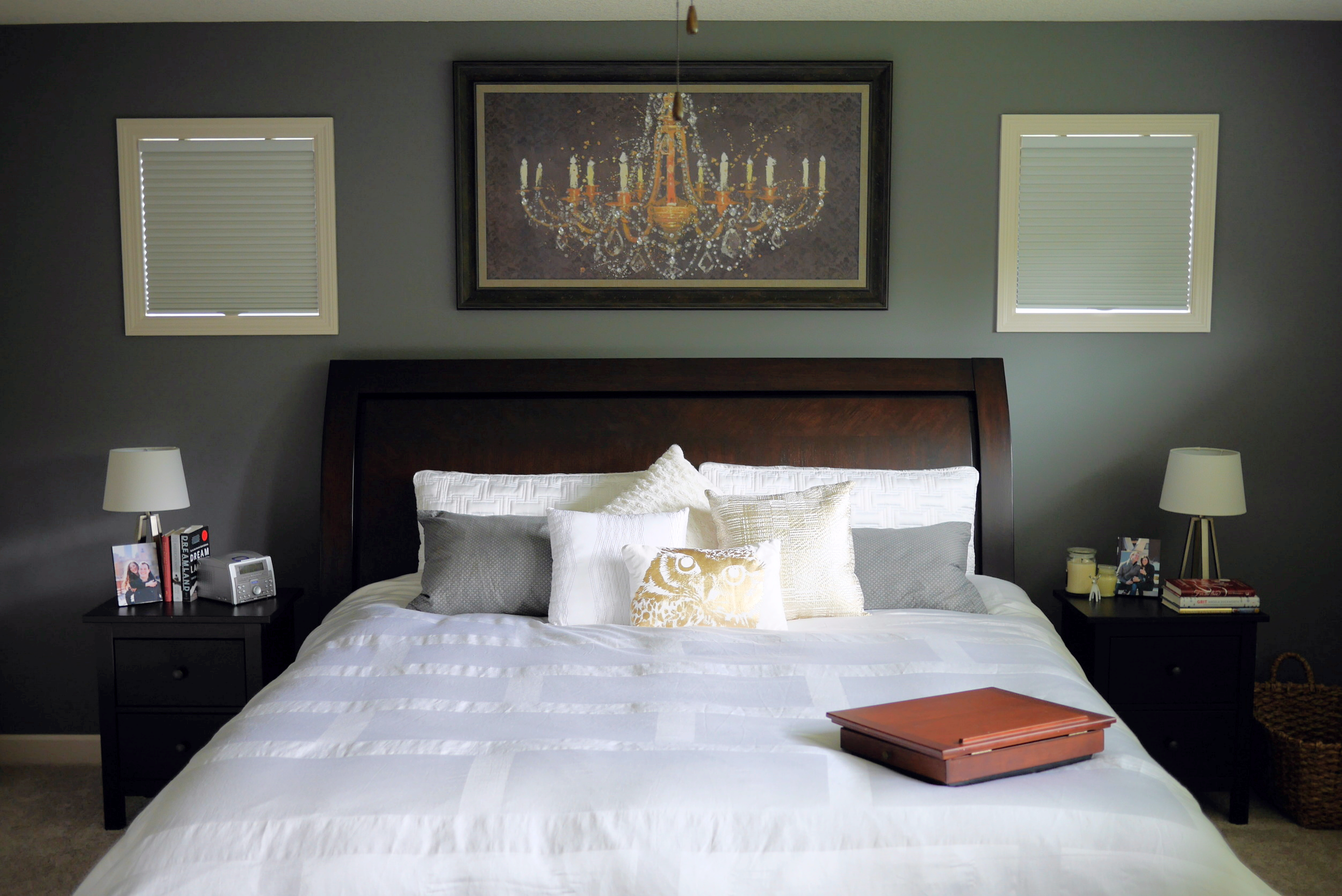
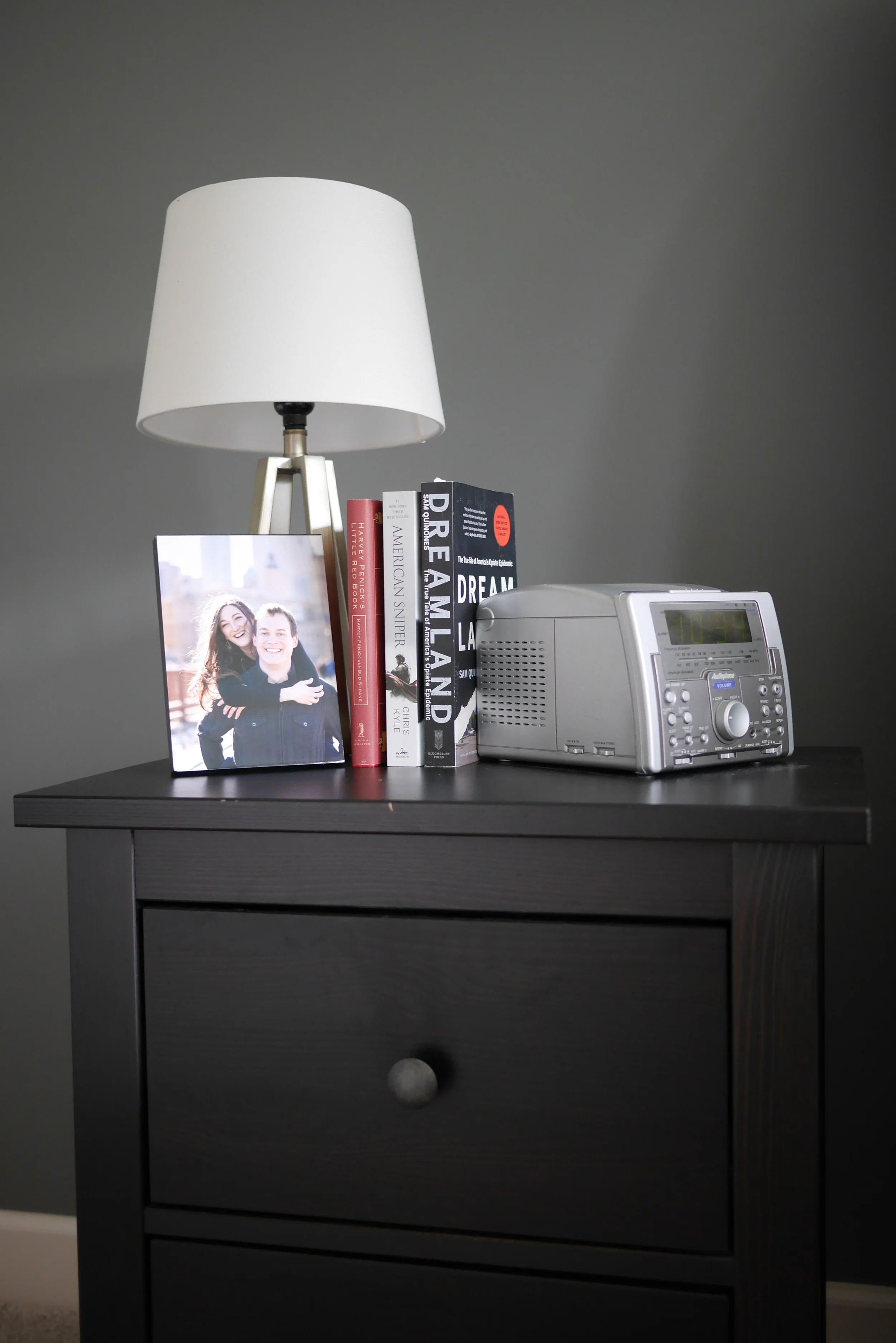
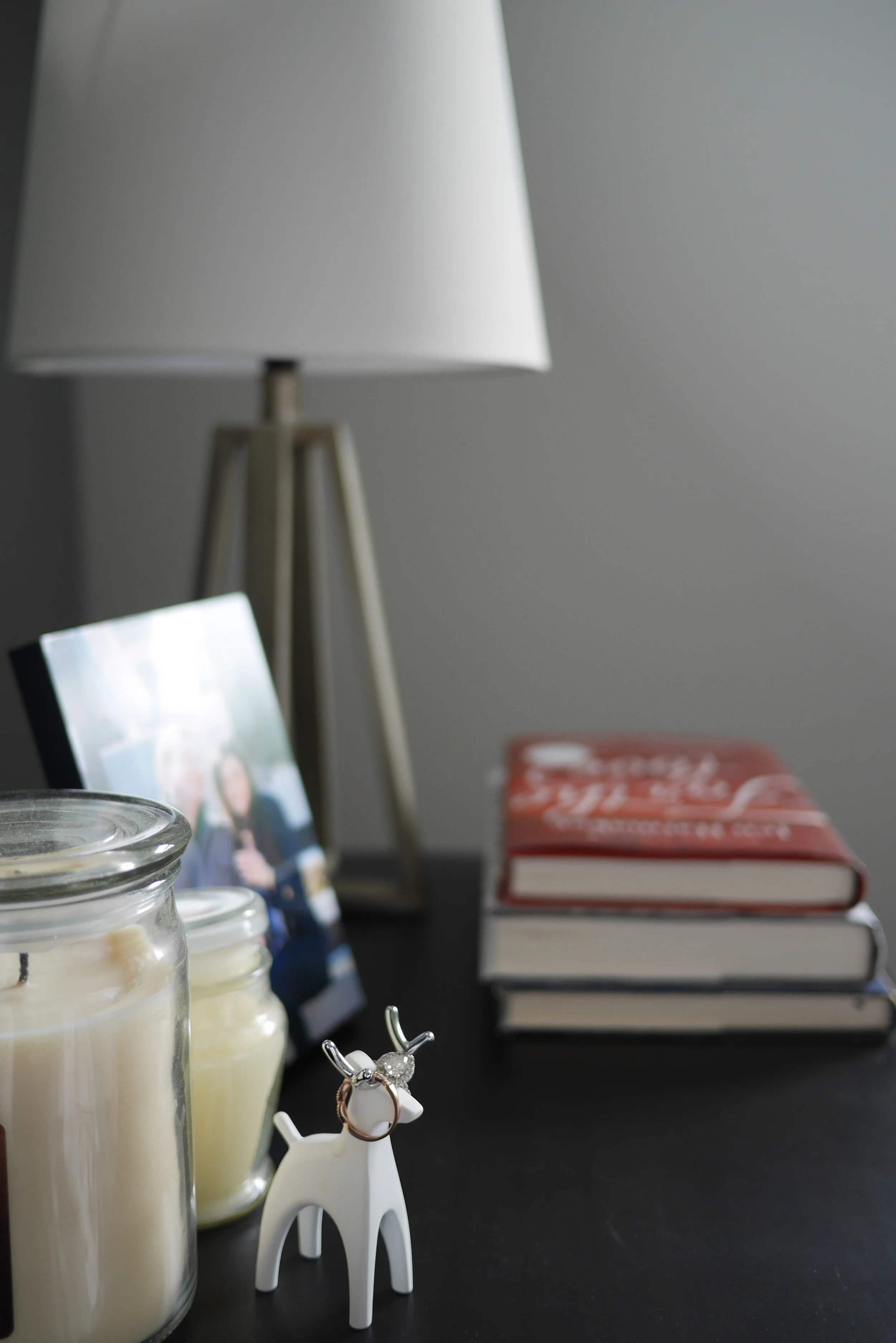
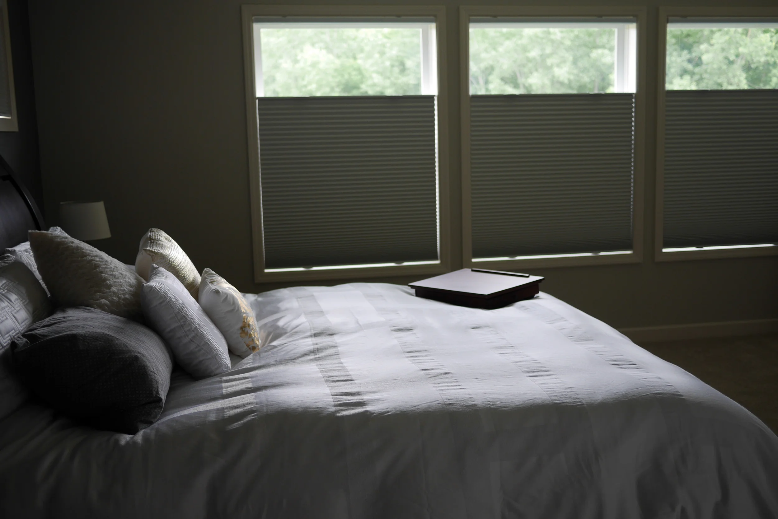
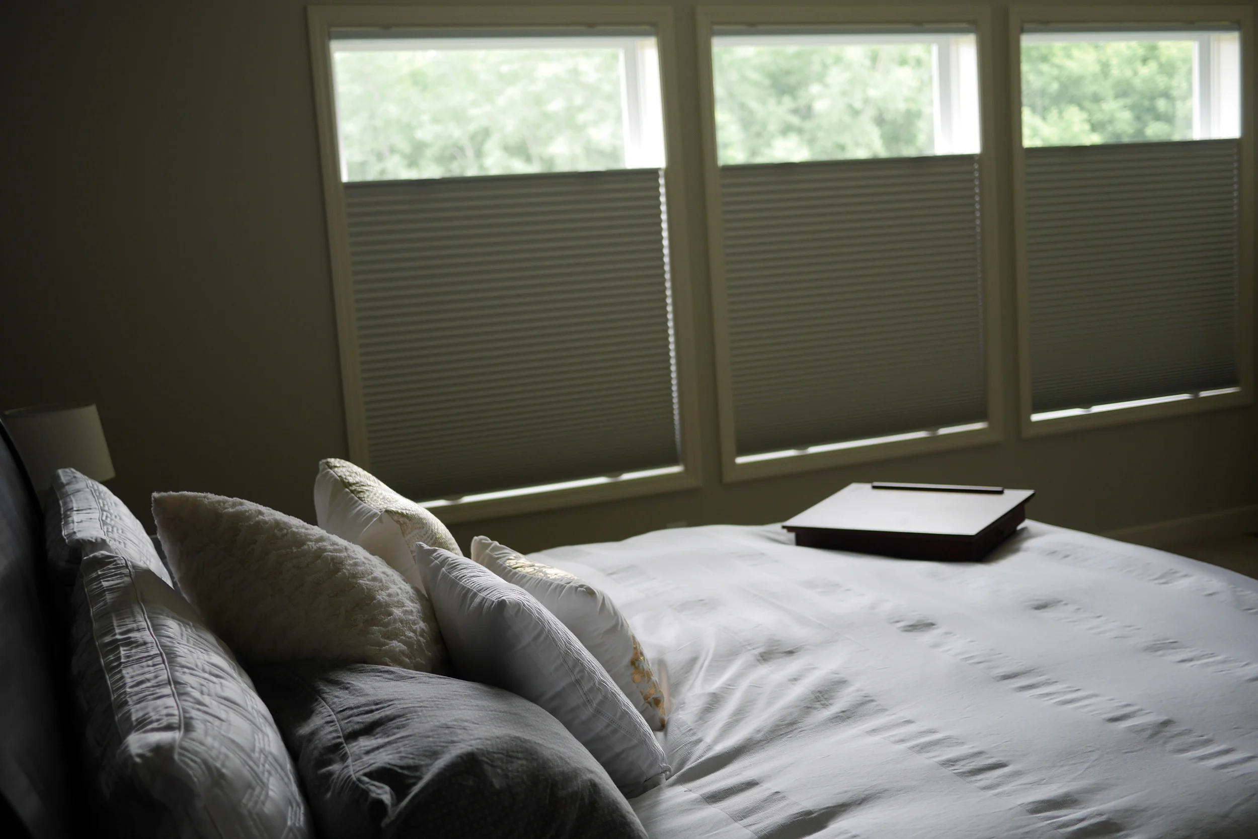
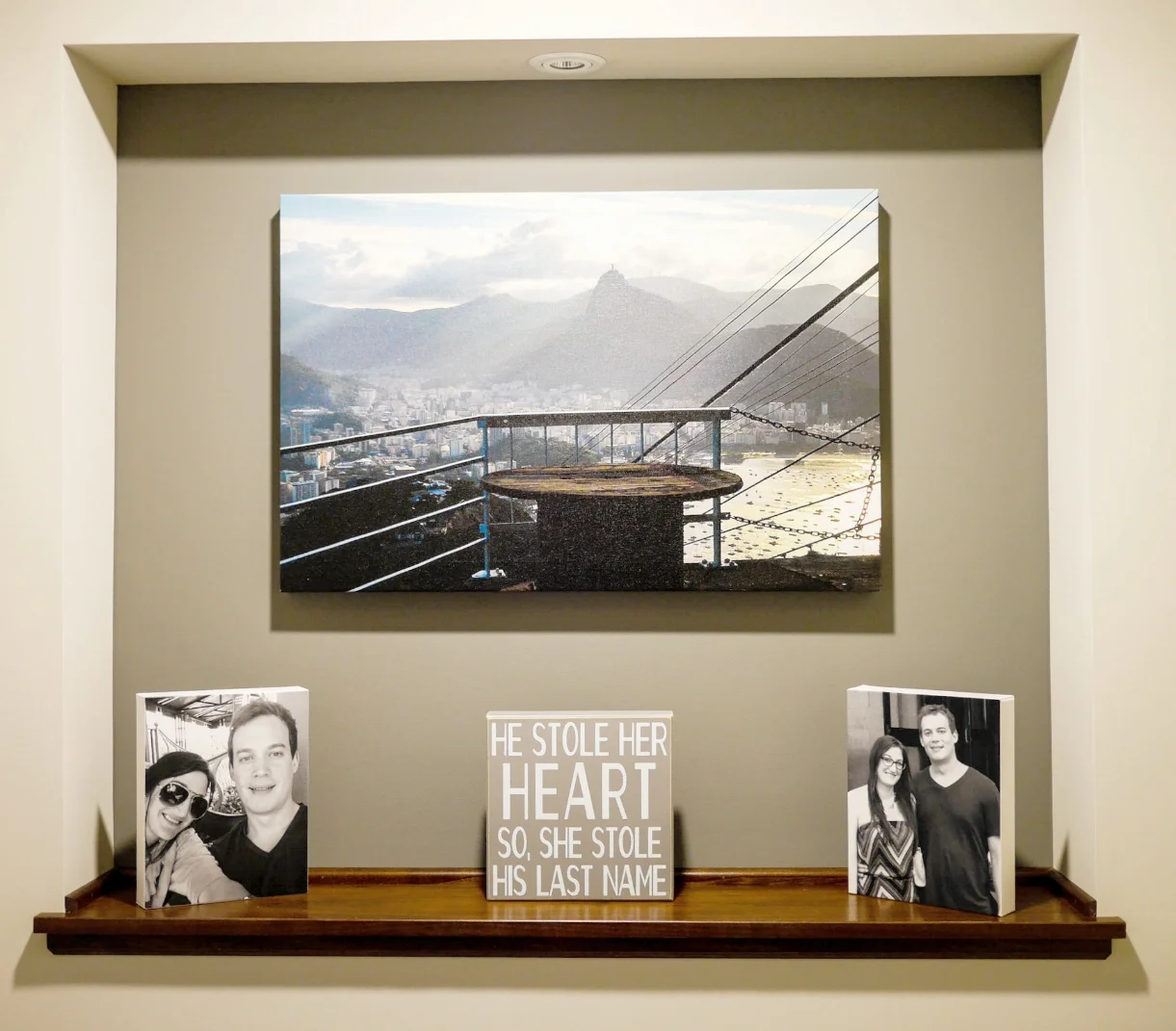
With grays running through our home we continued the theme in our master with a dark gray accent wall as well as a dark gray strip around our tray ceiling. The chandelier artwork played off of the grays while bringing in a bright pop of gold so it quickly became the focal point of the room. With such a bold statement piece we wanted to keep the rest of the decor simple and understated. Running golds and grays through our accent pillows ties walls to the bed and adds a variety of textures. Tripod lamps, books and personalized photos finish out the design finding a balanced look without seeking perfect symmetry.
Favorite Touch: Top-Down Bottom-Up Shades
These are simply fabulous. Providing privacy while still letting in natural light, these black out shades can be converted instantly to give your room a new look simply by playing with light. By going with a neutral gray/cream tone we left our options open for fabric side panels if we're in need of a new burst of color down the road. For now we're loving the clean crisp lines of the windows and the uncluttered feel of a bare wall - let that Qi flow freely!
No matter what your design style, when tackling your master bedroom my tip to you is less is more. Pick one or two focal points (the wooden king bed and chandelier artwork in our room) and simplify the rest. Keep the clutter out, you want a sanctuary to sleep and wake-up in, not something that is going to overstimulate the senses and make it difficult to relax. Use pillows and rugs to incorporate color and texture but don't over-do it, keep things practical and useful. There's something to the old "form follows function" train of thought, but who says you can't balance both?

